to have advanced substantially beyond the level of teenage metaphysics. A great deal is known today about the retina and its three types of cones, each with peak sensitivity in a different part of the spectrum. As explained in the appendix, however, the color sensation itself is formed not in the retina but in the brain, and what the brain does is nothing remotely as simple as just adding up the signals from the three types of cones. In fact, between the cones and our actual sensation of color there is a whirl of extraordinarily subtle and sophisticated computation: normalization, compensation, stabilization, regularization, even plain wishful seeing (the brain can make us see a nonexistent color if it has reason to believe, based on its past experience of the world, that this color ought to be there). The brain does all this computation and interpretation in order to give us a relatively stable picture of the world, one that doesn’t change radically under different lighting conditions. If the brain didn’t normalize our view in this way, we would experience the world as a series of pictures from cheap cameras, where colors of objects constantly change whenever the lighting is not optimal.
Beyond the realization that the interpretation of the signals from the retina is enormously complex and subtle, however, scientists know fairly little about how the sensation of color is really formed in anyone’s brain, let alone how exactly it could vary between different people. So given the inability to approach the color sensation directly, what hope is there of ever finding out whether different languages can affect their speakers’ perception of colors?
In previous decades, researchers tried to overcome this obstacle by devising clever ways of making people describe in words what they experienced. In 1984, Paul Kay (of Berlin and Kay fame) and Willett Kempton tried to check whether a language like English, which treats blue and green as separate colors, would skew speakers’ perception of shades near the green-blue border. They used a number of colored chips in different shades of green and blue, mostly very close to the border, so that the greens were bluish green and the blues greenish blue. This meant that, in terms of objective distance, two green chips could be farther apart from each other than one of them was from a blue chip. The participants in the experiment were requested to complete a series of “odd man out” tasks. They were shown three chips at a time and asked to choose which chip seemed most distant in color from the other two. When a group of Americans were tested, their responses tended to exaggerate the distance between chips across the green-blue border and to underestimate the distance between chips on the same side of the border. For example, when two chips were green and the third was (greenish) blue, the participants tended to choose the blue as being farthest apart, even if in terms of objective distance one of the greens was actually farther away from the other two. The same experiment was then conducted in Mexico, with speakers of an Indian language called Tarahumara, which treats green and blue as shades of one color. Tarahumara speakers did not exaggerate the distance between chips on different sides of the green-blue border. Kay and Kempton concluded that the difference between the responses of English and Tarahumara speakers demonstrated an influence of language on the perception of color.
The problem with such experiments, however, is that they depend on soliciting subjective judgments for a task that seems vague or ambiguous. As Kay and Kempton conceded themselves, English speakers could have reasoned as follows: “It’s hard to decide here which one looks the most different, since all three are very close in hue. Are there any other kinds of clues I might use? Aha! A and B are both
In an attempt to confront this problem head-on, Kay and Kempton repeated the same experiment with another group of English speakers, and this time the participants were told explicitly that they must not rely on the names of the colors when judging which chips were farther apart. But even after this warning, the responses still exaggerated the distance between the chips across the green-blue border. Indeed, when asked to explain their choices, the participants insisted that these chips really
For years it looked as if any attempt to determine in a more objective fashion whether language affects the perception of color would always lead to the same dead end, because there is no way of measuring objectively how close different shades appear to different people. On the one hand, it’s impossible to scan the sensation of color directly off the brain. On the other, if one wants to tease out fine differences in perception by asking people to describe what they see, one necessarily has to devise tasks that involve the choice between very close variants. The tasks might then seem ambiguous and without a correct solution, so even if the mother tongue is shown to influence the choice of answers, it can still be questioned whether language has really affected visual perception or whether it has merely provided inspiration for choosing an answer to a vague question.
It is only recently that researchers managed to maneuver themselves out of this impasse. The method they hit upon is still very indirect, in fact it is positively roundabout. But for the first time, this method has allowed researchers to measure objectively
One such experiment, published in 2008, was conducted by a team from Stanford, MIT, and UCLA-Jonathan Winawer, Nathan Witthoft, Michael Frank, Lisa Wu, Alex Wade, and Lera Boroditsky. We saw in chapter 3 that Russian has two distinct color names for the range that English subsumes under the name “blue”:
One of the two bottom squares was always exactly the same color as the upper square, and the other was a different shade of blue. The task was to indicate which of the two bottom squares was the same color as the one on top. The participants did not have to say anything aloud, they just had to press one of two buttons, left or right, as quickly as they could once the picture appeared on the screen. (So in the picture above, the correct response would be to press the button on the right.) This was a simple enough task with a simple enough solution, and of course the participants provided the right answer almost all the time. But what the experiment was really designed to measure was how long it took them to press the correct button.
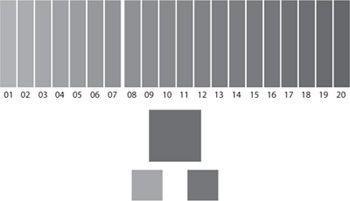
For each set, the colors were chosen from among twenty shades of blue. As was to be expected, the reaction time of all the participants depended first and foremost on how far the shade of the odd square out was from that of the other two. If the upper square was a very dark blue, say shade 18, and the odd one out was a very light blue, say shade 3, participants tended to press the correct button very quickly. But the nearer the hue of the odd one out came to the other two, the longer the reaction time tended to be. So far so unsurprising. It is only to be expected that when we look at two hues that are far apart, we will be quicker to register the difference, whereas if the colors are similar, the brain will require more processing work, and therefore more time, to decide that the two colors are not the same.
The more interesting results emerged when the reaction time of the Russian speakers turned out to depend not just on the objective distance between the shades but also on the borderline between